See them together
Five complete looks, with the same colour throughout so only the type changes. Tap a picture to see it full size, or use a pairing to fill in all three choices below.
1The name under the logo
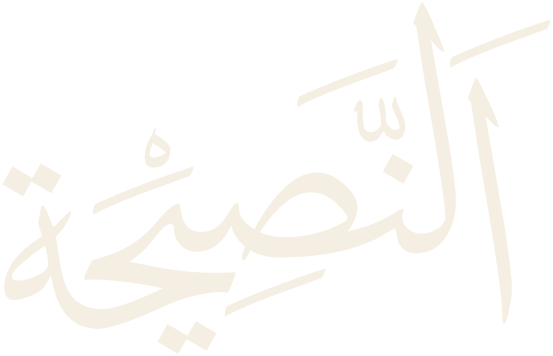
Capitals only, drawn once and saved as artwork. Each one is shown large, reversed out of the colour, and at 15 mm and 10 mm wide.
2Headings
Titles of posters, articles, kitab covers and the website. Everyone who makes something uses these, so a free font is worth a lot here.
3Body text
Everything people read at length, shown at the size it would be on a phone. Each font was checked for every transliteration letter: ā ī ū ḥ ṣ ḍ ṭ ẓ.
Your combination
Mix any name, heading and body from above, or start from a pairing. This shows your mix together, as an article page and as a post, and changes as you tap.
Anything to add?
Optional. A font you would like to see, or a reason for your choice.
Free: a Google font, free for print, the website and anything else. Premium: needs a paid licence, or an Adobe Creative Cloud plan, for each person who uses it.